Documentation

Looking for something in particular?

Quality Hub Dashboard

Introduction

Introducing the new Quality Hub Dashboard! As a part of our 3.22.0 release, we announced the Executive View for our Quality Hub Dashboard. The QA Coverage view will be released at a later date, so stay tuned!

Located within the Provar Quality Hub app, the Quality Hub Dashboard allows users to gain valuable insights and track KPIs and metrics for their quality maturity.
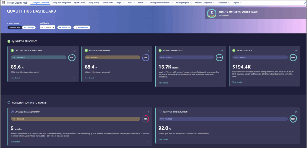
Quality Hub Metrics (Executive View)

There are 13 key metrics across 5 main value drivers that all tie back to KPIs and configuration that the user can set for their requirements.

Value Drivers

  1. Quality & Efficiency (Q&E)
  2. Accelerated Time to Market (ATTM)
  3. Strategic Innovation Capacity (SIC)
  4. Revenue Protection & Change Stability (RPCS)
  5. Scalable Growth Enablement (SGE)

Metrics

  1. Test Execution Success Rate (Q&E)
  2. Automation Coverage (Q&E)
  3. Manual Hours Saved (Q&E)
  4. Provar Grid ROI (Q&E)
  5. Average Release Duration (ATTM)
  6. Test Cycle Time Reduction (ATTM)
  7. Team Capacity Freed (SIC)
  8. New Initiatives (SIC)
    • Currently tracking new Features*
  9. Defect Escape Rate (RPCS)
  10. Risk Avoidance (RPCS)
  11. CSAT Improvement (RPCS)
    • Not currently being tracked in app
  12. Coverage Growth (SGE)
  13. Overall ROI (SGE)

Metrics Processing

Due to potentially large datasets being retrieved in the Quality Hub Dashboard, we have implemented a way to asynchronously process metrics and refresh the dashboard automatically.

Metrics are cached and the cache is accessible org-wide for your convenience.

If you see a spinner or message on any card indicating it is processing, the page will be refreshed once the metrics have successfully loaded.

Fig: Quality Hub Metrics Processing Asynchronously

More information and how to manually process & schedule the Quality Hub Metrics Processing is available in the Quality Hub Configuration page of the Provar Quality Hub app or Provar Quality Hub Setup > Quality Hub Metrics Configuration page.

Metric Cards

Each card shows a maturity tier (1- 4), overall goal to final maturity tier, the current value (%, #, etc.), and a highlighted insight on the card. Every metric card has a way to drill-down further into the metric insights, with a plethora of advanced insights and action items for each.

Metric Drill-down

Each metric drill-down (the detailed view) showcases a metric’s current value, a trend chart for the given time period, key insights, a breakdown of the data, how to improve, and the gaps between the maturity tiers for further analysis.

Filters and Exports

Currently, the Quality Hub Dashboard supports filtering for the Executive View based on the date range.
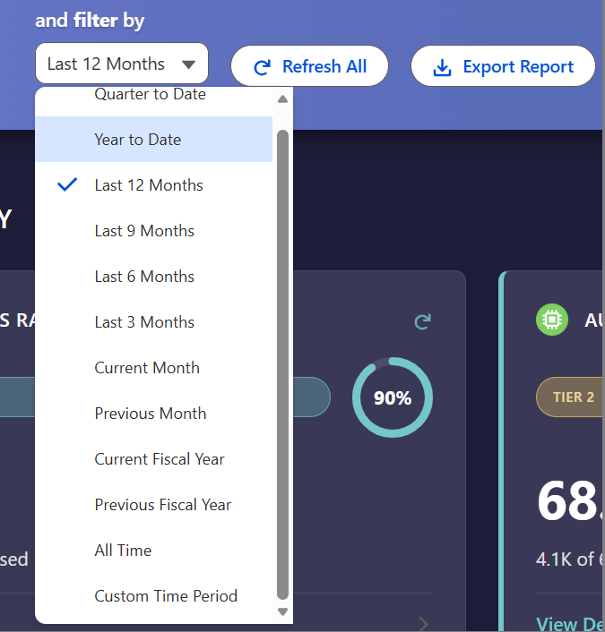
Users can select any date period in the range, or define a custom time period to retrieve metrics for the dashboard. Fiscal Years are defined from May-Apr.

All metrics can be exported individually or collectively by clicking the Export Report button.
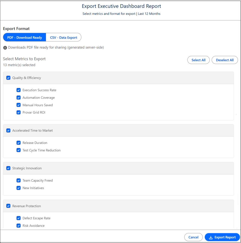
Simply select which metrics you’d like to include in the report, and the report type (CSV or PDF) then click Export Report.
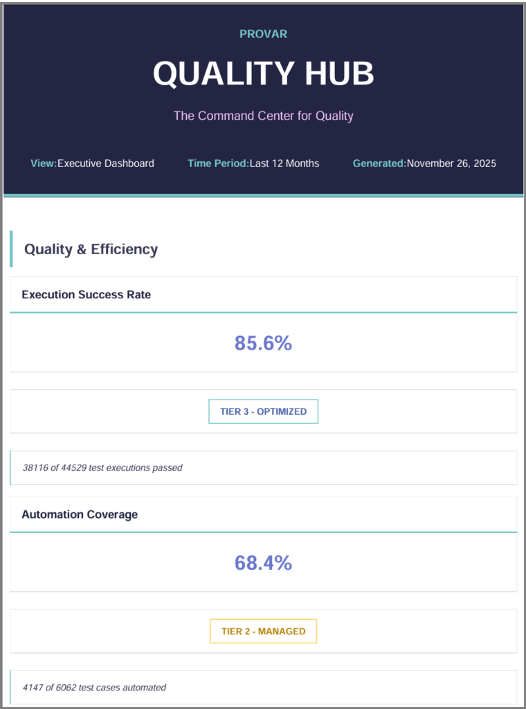
The report will include the current value, the maturity tier, and the highlighted insights from the metric card.

Provar Grid ROI

If you are using Provar Grid, this metric helps to track the relative return-on-investment from your Grid licenses. This helps to justify to stakeholders Grid usage, as well as providing a pathway to success on scaling your parallel testing efforts. For more information on Provar Grid and its benefits, see this page here!

The metric card shows the same information as other metrics, with an additional highlighted insight on the amount of manual testing hours saved and value generated from Grid based on parallelization time savings.

The metric drilldown shows even more information on your Grid usage, including an ROI trend over time, the value generation, net ROI, and savings breakdown by type (labor infrastructure, testing time).

You’ll also see the maturity tier information and steps on how to get more out of your Grid investment.

This helps to create more champions of the product and justify cost to leadership for automated tooling.

Risk Management and Risk Avoidance

Another key aspect of testing and QA is to reduce risk. But what is a risk? In Quality Hub, you can define Risks in a number of different ways. Take the below risk as an example.

Once a risk is defined, it goes through various stages before being considered “Mitigated”. This is up to your team on how you want to utilize risks, but we have created the basic framework for you already. Risks can be created from the Risks tab of the Provar Quality Hub app or directly from Test Plans.

If a risk has its Status updated to “Mitigated”, then the Risk Cost Avoided is calculated as a result based on an internal calculation, which includes the Risk Score * Average Defect Cost.

For example, this risk here has a Risk Level of “Very Low”, and therefore its Risk Cost Avoided is fairly low, but still significant based on the average cost of a defect.

For more information see, Risk Management here.

Now that this organization has a few risks marked as “Mitigated”, we can calculate the overall Risk Avoidance metric and display it here on the Quality Hub Executive Dashboard.

This metric card displays the total risk cost we have avoided in our organization, through the enablement of better testing, higher risk coverage, and proper mitigation strategies, which can also be generated by Quality Hub’s AI capabilities. This risk avoidance factor is a calculation of our total risk cost avoided across all risks that have been mitigated multiplied by the Risk Avoidance Factor, which is defined in the Cost Model Configuration page of the Provar Quality Hub app.

Drilling down further into the metric displays the risk avoidance over time, key insights from your data, and a breakdown of your risk numbers (such as average cost saved per risk and total # risks mitigated).

If you scroll down, you’ll see the familiar How to Improve section, with actionable steps to improve your risk avoidance maturity, and your Risk Avoidance KPI thresholds.

Overall ROI

Last but not least is the overall return-on-investment metric. This tracks your total ROI for your Provar investment across all of our products. Since the Quality Hub Dashboard is driven by configurable cost-model and KPIs, this is always relevant to your org’s spend and value gained.

This metric card highlights the overall ROI (total value gained – your total investment) in a dollar amount and % for convenience in reporting and KPI threshold management. The KPI thresholds for overall ROI are measured by percentage so that they are dynamic for each organization.

The metric drilldown displays this ROI trend over time, as well as vital insights and a numbers breakdown. The breakdown separates your savings by labor, Provar Grid (if applicable), risk avoidance, and maintenance.

The insights also display data-driven information around your per dollar value gains in Provar, your ROI breakdown by Product, and the biggest value driver behind your ROI, which in the example above is Risk Avoidance.

And lastly, you’ll see in the How to Improve section how you can capitalize on your Provar investment further, increase your ROI maturity, and get more bang for your buck by implementing better strategies for testing, scaling your automation with reusability in Provar Automation, and so on.

Conclusion

The Provar Quality Hub Dashboard is your one stop shop for key quality metrics and measuring your QA’s maturity over time. This dashboard provides metrics with configurable KPI thresholds that allow each user to define their goals for quality and get insights on how to achieve them.


Feedback

Was this article helpful for you?
Documentation library

Trying to raise a case with our support team?

We use cookies to better understand how our website is used so we can tailor content for you. For more information about the different cookies we use please take a look at our Privacy Policy.

Scroll to Top