Automation V3: CBMT User Interface
While using Component Based Model for Testing (CBMT), you can notice some subtle differences in the standard Test Builder user interface. For example, when authoring a Test case with Test Builder, a Web Component mapping will automatically detect Lightning Web Components (LWC ) or Screen Flow components that have matched the mapping criteria when selecting Add to Test Case for an element on the page.
You’ll be able to identify if CBMT is being used to map a component by taking a look at the Field Details section. The Component Type as Web Component and the type of component (Lightning, Screen Flow or Vlocity) that maps to the element selected on the web page.
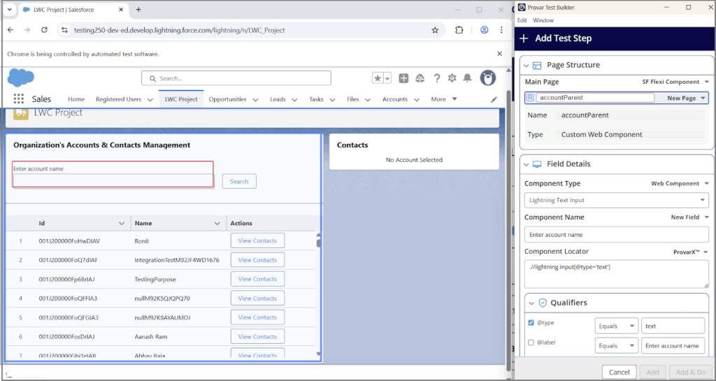
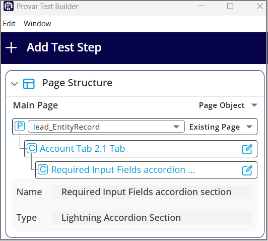
Page Structure
The Page Structure section displays the component hierarchy used to locate an element on a web page.
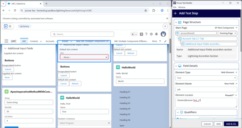
On selecting each level in the hierarchy, the name and type of the component are displayed and highlighted in blue on the web page.
The hierarchical page structure for LWC mappings, enables Provar to automatically switch tabs or open closed accordions during test execution. Earlier, these interactions required users to manually insert multiple test steps.
With the new hierarchy support for Flexi mappings, these actions are now seamlessly handled for LWC mappings in a single step and the benefits are listed below:
- Automates tab switching and accordion expansion in one streamlined action
- Eliminates the need for multiple manual steps to switch tabs or open accordions
Field Details
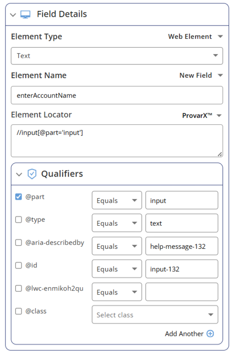
The field details section displays the information about the element selected:
- Component Name/ Element Name: The name given to map the element; this will be pre-populated if the field can be identified using an appropriate label.
- Qualifiers: The element attributes or properties that can be used to locate the element.
- Component Type/ Element Type: The type of component that maps to the element selected on the web page.
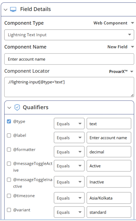
You can see field details for Web Component and Web Element in the screenshots given below.

Interaction Type
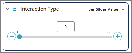
The Interaction Type section displays the interactions available for the type of element selected. The list of available interactions will only display interactions available for the current state of the selected element.

Some components may have a specific interaction and user interface to provide a similar user experience for the selected element. For example, the Lightning Slider is displayed with a slider.
- Home
- Get Started with V3
- System Requirements
- Automation V3: Skip Welcome Screen on Launch
- Browser and Driver Recommendations
- Installing Provar Automation V3
- Updating Provar Automation V3
- Licensing Provar Automation V3
- Automation V3: Granting Org Permissions to Provar Automation
- Automation V3: Optimizing Org and Connection Metadata Processing in Provar
- V3 Connections
- AI with Provar Automation V3
- Closing the AI Quality Gap with Provar
- FAQ: Provar AI Capabilities
- Automation V3: Understanding Provar’s Use of AI Service for Test Automation
- Automation V3: Enable or Disable AI Features in Provar
- Automation V3: Provar Assistant
- Automation V3: Image Validator
- Automation V3: Intent Validator
- Automation V3: Test Data Generation
- Automation V3: Test Step Generation
- Automation V3: Utterance Generator
- Automation V3: Using Standardized Test Agent APIs
- Using Provar Automation V3
- Automation V3: Content Synchronization
- Automation V3: Feature-by-Feature Guide
- Automation V3: Provar Automation
- Automation V3: Creating a New Test Project
- Automation V3: Import Test Project from a File
- Automation V3: Import Test Project from a Remote Repository
- Automation V3: Import Test Project from Local Repository
- Automation V3: Commit a Local Test Project to Source Control
- Automation V3: Salesforce API Testing
- Automation V3: Behavior-Driven Development
- Automation V3: Consolidating Multiple Test Execution Reports
- Automation V3: Creating Test Cases
- Custom Table Mapping in V3
- Functions in V3
- Automation V3: Using Functions
- Automation V3: Count
- Automation V3: DateAdd
- Automation V3: DateFormat
- Automation V3: DateParse
- Automation V3: GetEnvironmentVariable
- Automation V3: GetSelectedEnvironment
- Automation V3: IsSorted
- Automation V3: Not
- Automation V3: NumberFormat
- Automation V3: Round
- Automation V3: StringNormalize
- Automation V3: StringReplace
- Automation V3: StringTrim
- Automation V3: TestCaseErrors
- Automation V3: TestCaseName
- Automation V3: TestCaseOutCome
- Automation V3: TestCasePath
- Automation V3: TestCaseSuccessful
- Automation V3: TestRunErrors
- Automation V3: UniqueId
- Automation V3: Debugging Tests
- Automation V3: Creating Custom Test Steps
- Automation V3: Defining Proxy Settings
- Automation V3: Environment Management
- Automation V3: Exporting Test Projects
- Automation V3: Japanese Language Support
- Automation V3: Customize Browser Driver Location
- Automation V3: Managing Test Steps
- CBMT in V3
- Automation V3: Provar Test Builder
- ProvarDX in V3
- Automation V3: Refresh and Recompile
- Automation V3: Reintroduction of CLI license Check
- Automation V3: Reload Org Cache
- Automation V3: Reporting
- Automation V3: Running Tests
- Automation V3: Searching Provar with Find Usages
- Automation V3: Secrets Management and Encryption
- Automation V3: Setup and Teardown Test Cases
- Automation V3: Tags and Service Level Agreements (SLAs)
- Test Cycles in V3
- Automation V3: Test Plans
- Automation V3: Testing Browser – Chrome Headless
- Automation V3: Testing Browser Options
- Automation V3: Tooltip Testing
- Using Custom APIs in V3
- Callable Tests in V3
- Data-Driven Testing in V3
- Page Objects in V3
- Automation V3: Introduction to XPaths
- Automation V3: Creating an XPath
- Automation V3: JavaScript Locator Support
- Automation V3: Maintaining Page Objects
- Automation V3: Refactoring Page Objects
- Automation V3: Mapping Non-Salesforce Fields
- Automation V3: ProvarX™
- Automation V3: Refresh and Reselect Field Locators in Test Builder
- Automation V3: Create different page objects for different pages
- Applications Testing in V3
- Automation V3: Database Connections
- Automation V3: PDF Testing
- Automation V3: Email Testing in Automation
- Automation V3: Email Testing Examples
- Automation V3: Gmail Connection in Automation with App Password
- Automation V3: App Configuration for Microsoft Connection in MS Portal for OAuth 2.0
- Automation V3: OAuth 2.0 Microsoft Exchange Email Connection
- Automation V3: Support for Existing MS OAuth Email Connection
- Automation V3: OAuth 2.0 MS Graph Email Connection
- Automation V3: Create a Connection for Office 365 GCC High
- Automation V3: Mobile Emulation (Salesforce Mobile)
- Automation V3: Using Provar with Amazon Web Services (AWS) Device Farm
- Automation V3: Web Services
- Automation V3: Integrating with Jira
- Automation V3: Provar Feature Flags and Properties Configuration
- Automation V3: Using Java Method Annotations for Custom Objects
- Automation V3: Test Palette Introduction
- Automation V3: Apex Bulk
- Automation V3: Apex Execute
- Automation V3: Assert Test Step
- Automation V3: Assert Salesforce Layout
- Automation V3: Break Test Step
- Automation V3: Extract Salesforce Layout
- Automation V3: Fail Test Step
- Automation V3: Finally Test Step
- Automation V3: For Each Test Step
- Automation V3: Generate Test Case
- Automation V3: Group Steps Test Step
- Automation V3: If Test Step
- Automation V3: List Compare
- Automation V3: Page Object Cleaner
- Automation V3: Read Test Step
- Automation V3: Set Values Test Step
- Automation V3: Set Values
- Automation V3: Sleep Test Step
- Automation V3: String Test Steps
- Automation V3: Switch Test Step
- Automation V3: UI Action
- Automation V3: UI Assert
- Automation V3: UI Connect
- Automation V3: UI Fill
- Automation V3: UI Handle Alert
- Automation V3: UI Navigate
- Automation V3: UI On Screen
- Automation V3: UI With Row
- Automation V3: Wait For Test Step
- Automation V3: While Test Step
- Automation V3: Override Auto-Retry for Test Step
- Automation V3: Using Encrypted Password Variables in Expression Editors
- DevOps with V3
- Automation V3: Introduction to Provar DevOps
- Automation V3: Introduction to Test Scheduling
- Automation V3: Setting Java Development Kit (JDK) Environment Variables
- Automation V3: Configuration on Jenkins
- Automation V3: Version Control and DevOps
- Automation V3: Setting up Continuous Integration
- Automation V3: Execution Environment Security Configuration
- Automation V3: Bitbucket Pipelines
- Automation V3: Perfecto Mobile
- Automation V3: ANT Task Parameters
- Automation V3: Provar Jenkins Plugin
- Automation V3: Running Automation Tests on Jenkins
- Automation V3: Configuring the Automation Secrets Password in Microsoft Azure Pipelines
- Automation V3: Parallel Execution in Microsoft Azure Pipelines using Test Plans
- Automation V3: Parallel Execution in Microsoft Azure Pipelines using Targets
- Automation V3: Parallel Execution in Microsoft Azure Pipelines using Multiple build.xml Files
- Automation V3: Parallel Execution in GitHub Actions using Test Plan
- Automation V3: Running Provar on Linux
- Automation V3: CircleCI Orbs
- Automation V3: CircleCI Common Build Errors
- Automation V3: CircleCI via Docker
- Automation V3: Copado Integration Introduction
- Automation V3: Copado Configuration
- Automation V3: Copado Architecture Overview
- Automation V3: Docker Runner
- Automation V3: Running Provar Tests on Docker using Docker File
- Automation V3: Docker Continuous Integration
- Automation V3: Setting up Continuous Integration with Jenkins for Docker
- Automation V3: Generating the build.xml File for Docker
- Automation V3: Flosum Configuration
- Automation V3: Flosum Integration Introduction
- Automation V3: Flosum Architecture Overview
- Automation V3: Parallel Execution in GitHub Actions using Multiple build.xml Files
- Automation V3: Parallel Execution in GitHub Actions using Targets
- Automation V3: Remote Trigger in GitHub Actions
- Automation V3: Parallel Execution in GitHub Actions using Job Matrix
- Automation V3: Gearset DevOps CI/CD via Jenkins
- Automation V3: GitLab Continuous Integration
- Automation V3: GitHub Desktop – Creating a Git Repository for Automation Projects
- Automation V3: Integrating GitHub Actions CI to Run Automation CI Task
- Automation V3: Provar Test Results Package
- Automation V3: Running a Provar CI Task in Azure DevOps Pipelines
- Automation V3: Amazon Web Service (AWS) & Jenkins Configuration
- Automation V3: ANT: Generating ANT Build File
- Automation V3: ANT Licensing
- Automation V3: Reading Data from Excel
- Automation V3: Configuration on other CI tools
- Automation V3: Setting Apache Ant Environment Variables
- Automation V3: BrowserStack Desktop
- Automation V3: Integrating with LambdaTest
- Automation V3: Sauce Labs Desktop
- Automation V3: AutoRABIT Salesforce DevOps in Provar Test
- Automation V3: Selenium Grid
- Automation V3: Working with Git
- Automation V3: Configuration for Sending Emails via the Automation Command Line Interface
- Automation V3: Parameterization using Environment Variables in GitHub Actions
- Automation V3: Slack Integration with Automation
- Automation V3: Zephyr Cloud and Server
- Automation V3: Adding a Salesforce Communities Connection
- Automation V3: Integrating with Sauce Labs Real Device
- Automation V3: Travis CI
- Automation V3: Salesforce DX Integration
- Automation V3: Variable Set Syntax
- Automation V3: Visualforce Testing
- Automation V3: List and Table Testing
- Automation V3: Salesforce Lightning Web Component (LWC) Locator Support
- Automation V3: Salesforce Console Testing
- Recommended Practices with V3
- Automation V3: Provar Naming Standards
- Automation V3: Object Mapping Between Provar Automation and Provar Manager
- Salesforce API Access Control Security Update – Impact on Provar Connections
- Automation V3: Salesforce Connection Best Practices
- Automation V3: Automation Planning
- Automation V3: Supported Testing Phases
- Automation V3: Best practices for the .provarCaches folder
- Automation V3: Best practices for .pageObject files
- Automation V3: Avoid Metadata performance issues
- Automation V3: The Best Ways to Change Callable Test Case Locations
- Automation V3: Improve Your Metadata Performance
- Automation V3: Abort Unused Test Sessions/Runs
- Automation V3: Create Records via API
- Automation V3: Test Case Design
- Automation V3: Increase auto-retry waits for steps using a global variable
- Troubleshooting with V3
- Automation V3: How to Use Keytool Command for Importing Certificates
- Automation V3: Resolving High Memory Usage
- Automation V3: Refresh Org Cache Manually
- Automation V3: Show Hidden Provar Files on Mac
- Automation V3: Add Permissions to Edit Provar.ini File
- Automation V3: Test Builder Does Not Launch
- Automation V3: Provar License Issue Solution
- Automation V3: How to Configure a Single Sign-On Connection
- Automation V3: Out of Memory Error During CI Execution
- Automation V3: Add Gmail Firewall Exception
- Automation V3: Add a License Firewall Exception
- Automation V3: Resolving Jenkins License Missing Error
- Automation V3: Increase System Memory for Provar
- Automation V3: Resolving Metadata Timeout Errors
- Automation V3: Java Version Mismatch Error
- Automation V3: Provar Manager 3.0 Install Error Resolution
- Automation V3: Test Case Does Not Run on IE Browser
- Automation V3: Test Builder Not Working Correctly
- Automation V3: Internationalization Support
- Automation V3: Salesforce Release Updates
- V3 Release Notes